Selected portfolio
Moderated usability test of the A1 mobile application
-
Client:

- Number of tasks completed by respondents: 19
- Number of respondents: 20
- Number of recommendations: 27
- Pages in the report: 59
- Type of service: online moderated usability test with respondents


Comparative usability test
between the website of DSK Bank and a prototype of the website of Societe Generale Expressbank
-
Client:
- Number of tasks completed by respondents: 25
- Number of respondents: 10
- Number of recommendations: 42
- Pages in the report: 116
- Type of service: online moderated usability test with respondents


Moderated usability test
of the desktop version of the А1 online store
-
Client:
- Number of tasks completed by respondents: 19
- Number of respondents: 15
- Number of recommendations: 35
- Pages in the report: 79
- Type: online moderated usability test with respondents

Moderated usability test
of the Priroden application
-
Client:
- Number of tasks completed by respondents: 10
- Number of respondents: 14
- Number of recommendations: 21
- Pages in the report: 60
- Type: online moderated usability test with respondents


Moderated usability test
of the BNP Paribas Personal Finance application
-
Client:
- Number of tasks completed by respondents: 12
- Number of respondents: 10
- Number of recommendations: 19
- Pages in the report: 56
- Type: online moderated usability test with respondents


Moderated usability test
of the website of Bulgarian American Credit Ban
-
Client:
- Number of tasks completed by respondents: 26
- Number of respondents: 10
- Number of recommendations: 36
- Pages in the report: 73
- Type: online moderated usability test with respondents


Expert analysis
of some screens of the ERP user interface of nZoom
-
Client:
- Number of recommendations: 26
- Pages in the report: 18
- Type: expert usability analysis


Case studies

Selected recommendations
for the A1 mobile application
Identified issue:
The users do not understand what they need to type in the "Number of service" field
Recommendations:
It is a good practice to add an explanation to describe what is "Number of service/contract" and why it is a required field. It is also advisable to explain that even if the user enters the number of only one service on this screen, all of the registered services under their name will be automatically added to the account. We recommend the addition of an info button that will open a pop-up with screenshots showing where to find the number (including the number of characters that it contains), in order to assist the user in finding it.

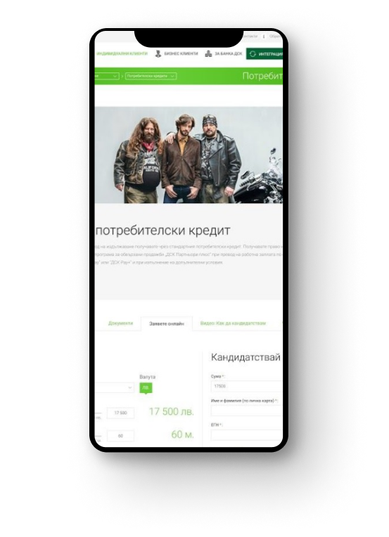
Selected recommendations
website for DSK Bank
Identified issue:
Users are searching for a "Credit calculator" instead of "Online application" on the product page when they want to perform a calculation
Recommendations:
Move the calculator to the first tab on the product page, as it is one of the most used tools. If it needs to remain in a separate tab, rename the tab to include the word "calculator" in its name. Additionally, add visible links to the required application documents on the calculator page.
Selected recommendations
mobile version of BNP Paribas Personal Finance website
Identified issue:
The user skips clicking on "Consolidation" and enters the amount in the "Personal credit" field.
Recommendations:
Change the consolidation icon. Rename the product to "Consolidate your credits". Alternatively, consider changing the user journey so that the user only enters the desired loan amount on this screen. On the next screen, as part of the chat flow, ask the user about the purpose of the loan they want to apply for. This screen can provide brief explanations for each product, as there will be enough space available.
Selected recommendations
mobile version of BAKB website
Identified issue:
When using the mortgage calculator, the user experiences difficulties recalculating years (25 in the scenario) to months that need to be entered into the calculator.
Recommendations:
It would be beneficial to include a months-to-years converter in the calculator, displaying the value of years alongside the months. This will allow the user to easily see the duration in years. An alternative solution would be to add radio buttons for the user to specify whether the value in the calculator is in months or years, dynamically changing the label after the value to make it visible to the user.

Selected recommendations
for the Priroden application
Identified issue:
The user perceives the "Search in this region" field as a search engine and, consequently, does not think of refreshing the results for their specific region.
Recommendation:
Automatically refresh the map after adjusting the visible area. Alternatively, rename the "Search in this region" field to something like "Refresh results for this region."
Result:
Within 3 days of identifying the issue, the automatic refresh of the map has been implemented, effectively resolving the problem.
Selected recommendations
for the Priroden application
Identified issue:
After adding a littered spot on the map, participants expect it to appear immediately. They do not read or understand the message that states added spots need to be reviewed and approved by a moderator.
Recommendations:
Use graphical elements to highlight the message "Your spot is being reviewed." Additionally, add a message informing users that the spot will be visible on the map after review and approval by a moderator.
Result:
Both recommendations were implemented within 2 weeks after the initial recommendation. The issue is no longer observed as frequently after these adjustments.
